


In this short article, I will demonstrate how to build a stylish button border animation using CSS hover.
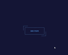
Here is a sneak peek at the project we will be working on:
Step 1: Create and Style Button.
For this project, we will only require one html button element, and I have positioned it in the middle of the page. I have also given it a position of relative and added borders in addition to other stylings to make our button beautiful.
Create two files and name them whatever you want, one for HTML, which we'll be using for our index.html file, and the other for CSS, which we'll be using for our styles.css file.
Here is the code for your index.html file:
<html>
  <head>
    <title>button</title>
  </head>
  <body>
    <button class="button"> see more </button>
  </body
Put this into your css file:
html,body{
  height: 100%;
}
body{
  background: #151636;
  display: flex;
  align-items: center;
  justify-content: center;
}
.button{
  font-size: 18px;
  color : #63A2EC;
  padding: 20px 50px;
  border:1px solid #63A2EC;
  border-radius: 2px;
  background : transparent;
  position: relative;
}
Step 2: Creating the Second Border
We will use ::before and ::after elements to create a second border that syncs with our button.
Paste the code below into your styles.css file to get the look:
.button::after,
.button::before{
  content: "";
  position: absolute;
  border: inherit;
  transition:  .5s;
  width: 40px;
  height: 40px;
  border-radius: 2px;
}
Your page should look like this now:
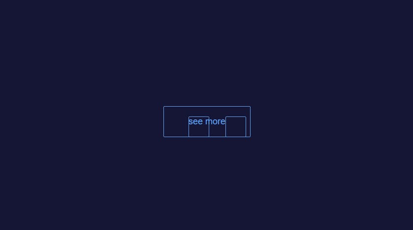 According to what we see on our browser, the code above has actually created two new elements, each having heights and widths of 40px. We've also given it a
 border: inherit; to inherit or take just the border stylings of its parent element, the original html button. Let's make those new elements look cool now.
paste the code below into your css file to:
.button::before{
  top: -15px;
  left: -15px;
  border-width: 1px 0 0 1px;
}
.button::after{
  bottom: -15px;
  right: -15px;
  border-width: 0 1px 1px 0;
}
The image below shows what the button on your browser should look like.
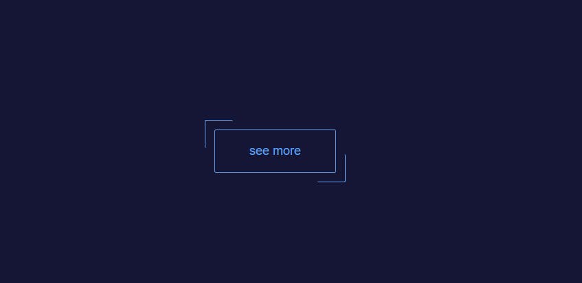
You have seen that things are falling into place bit by bit, so we put the button::before element at the top left of our original button and removed border-width-right and bottom-border-widths, and the same thing applies to the button::after element, which we put at the bottom right corner and removed border-width from the top and left.
Step 3: Animating the Button.
You can trigger the animation by copying and pasting the code below.
.button:hover::after,
.button:hover:before{
  width: calc(100% + 27px);
  height: calc(100% + 30px);
}
Try hovering over the button to see how beautifully it animates, when running on your browser.
I will explain how the code listed above works.
the width:calc() function lets us assign 100% of the parent element to the ::before and ::after elements, therefore allowing us to include an extra 27px on each element. We have done the same thing with the height:calc() function, but here we have added 30px so that the borders are touching when we hover over them.
Please visit the link below for more information about the calc() function in CSS.mozilla css article on calc.
Conclusion
Was this useful?
- Follow me for more post like this so we don't lose track of each other.
- Show your support by leaving lots of reactions.
- Spread the knowledge by sharing it.
Cheers guys.