Create Custom Radio Buttons with Styled Components

👋 Expert Frontend Developer | React.js Maestro 🚀 | Exploring Rust 🦀
🌟 Crafting exceptional web experiences is my forte.
📩 Reach out at chukwukareuben09@gmail.com.
We cannot add styles to the default radio buttons. In this article, we'll take a look at how to design custom radio buttons using styled components and React.js.
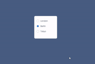
Demo
Below is a preview of what we're going to be building:
Introduction: Radio Buttons
Radio buttons are a common way to allow users to make a single selection from a list of options. Since only one radio button can be selected at a time (within the same group), each available choice must be its own item and label.
The singular property of a radio button makes it distinct from checkboxes, where the user can select and unselect any number of items.
Now that we know what radio buttons are, let's get started.
Step 1: Installation
To download styled-components run:
npm install --save styled-components
That's all you need to do, you are now ready to use it in your app! 👌
Step 2: Creating our components
Navigate to your App.js file and paste the code below
export default function App() {
  return (
   <Container>
        <Label id="london">
            <Input type="radio" name="location" id="london" value="london" />
            <RadioBox></RadioBox>
            <Paragraph>London</Paragraph>
          </Label>

          <Label id="berlin">
            <Input type="radio" name="location" id="berlin" value="berlin" />
            <RadioBox></RadioBox>
            <Paragraph>Berlin</Paragraph>
          </Label>

          <Label id="tokyo">
            <Input type="radio" name="location" id="tokyo" value="tokyo" />
            <RadioBox></RadioBox>
            <Paragraph>Tokyo</Paragraph>
          </Label>
    </Container>
)
}
Don't worry if you get errors on your computer now, we still have to design the components. But now there are a few things to note in the above code and I'll list them below.
note:
The radio group must have share the same name (the value of the name attribute) to be treated as a group.
Once the radio group is created, selecting any radio button in that group automatically deselects any other selected radio button in the same group.
You can have as many radio groups on a page as you want, as long as each group has its own name.
The value attribute defines the unique value associated with each radio button. The value is not shown to the user, but is the value that is sent to the server on "submit" to identify which radio button that was selected.
Always add the label tag for best accessibility practices!. In this article the label tag will be vital, it's the element that will enable us to check our radio buttons.
Step 3: Adding Styles
Create and navigate to a new "Radio.styled.js" file. Paste the following code into your new file:
import styled from "styled-components";


export const Container = styled.div`
  background: white;
  display: inline-flex;
  height: 10rem;
  width: 10rem;
  border-radius: 0.5rem;
  justify-content: center;
  padding-left: 1rem;
  padding-right: 1rem;
  flex-direction: column;
`;
export const Label = styled.label`
  display: flex;
  align-items: center;
  margin-bottom: 1rem;
`;

export const Paragraph = styled.p`
  color: #334680;
  font-size: 0.875rem;
  line-height: 1.313rem;
  font-family: "Poppins", sans-serif;
  font-weight: 600;
  margin-left: 0.2rem;
`;
The code above contains the styles for the Container, Label, and Paragraph components.
Step 4: Styling RadioBox and Input Components.
Okay guys, this is the most important part of the article and I want us to pay close attention to it.
export const RadioBox = styled.div`
  height: 1.125rem;
  width: 1.125rem;
  border: 1px solid #b9bdcf;
  border-radius: 50%;
  display: flex;
  align-items: center;
  justify-content: center;
  cursor: pointer;
  margin-right: 0.4rem;
  transition: background 0.15s, border-color 0.15s;
  padding: 2px;

  &::after {
    content: "";
    width: 100%;
    height: 100%;
    display: block;
    background: #2266dc;
    border-radius: 50%;
    cursor: pointer;
    transform: scale(0);
  }
`;
The RadioBox will be our actual custom radio button, as you can see in the snippet, we gave it a height and width with a radius of 50% to make it look like a radio button.
The after pseudo class "(&::after {})" allows us to create a virtual element in the RadioBox and from the code snippet we gave it a background color and a border radius of 50% to make it all round.
Note that with " transform: scale(0);" we scaled our virtual element to zero.
Step 5: Styling Our Input Component.
export const Input = styled.input`
  display: none;
  &:checked + ${RadioBox} {
      &::after {
        transform: scale(1);
      }
`;
- From the code snippet above, we displayed our default input to zero.
- But we can also see that on the check of our input button we are transforming our RadioBox after element to 1 where by making it visible.
- One thing we should also note from the the Input styling above is that we are allowed to pass components as props and style them too.
Now that we are all done with the Component styling, Let's quickly give our web page a global styling .
Step 6: Global styling.
Create and navigate to a new style.css file and paste the code below.
@import url("https://fonts.googleapis.com/css2?family=Poppins:wght@200&display=swap");
* {
  padding: 0;
  margin: 0;
  box-sizing: border-box;
}
html,
body {
  height: 100%;
  width: 100%;
}
body {
  background: #495c83;
  display: flex;
  flex-direction: column;
  align-items: center;
  justify-content: center;
}
Step 7: Import our Styles
Now that we are done with our styling, all that is left is to import our styles into our app.js file. Copy and paste the code snippet below to import.
import {Container, Label, Paragraph, RadioBox, Input } from './radio.styled';
import "./styles.css";
All errors should be gone by now, If you're still experiencing any error check below for the complete codes .
Complete codes
App.js
import React from 'react';
import {Container, Label, Paragraph, RadioBox, Input } from './radio.styled';
import "./styles.css";


export default function App() {
  return (
   <Container>
        <Label id="london">
            <Input type="radio" name="location" id="london" value="london" />
            <RadioBox></RadioBox>
            <Paragraph>London</Paragraph>
          </Label>

          <Label id="berlin">
            <Input type="radio" name="location" id="berlin" value="berlin" />
            <RadioBox></RadioBox>
            <Paragraph>London</Paragraph>
          </Label>

          <Label id="tokyo">
            <Input type="radio" name="location" id="tokyo" value="tokyo" />
            <RadioBox></RadioBox>
            <Paragraph>Tokyo</Paragraph>
          </Label>
    </Container>
)
}
radio.styled.js
import styled from "styled-components";


export const Container = styled.div`
  background: white;
  display: inline-flex;
  height: 10rem;
  width: 10rem;
  border-radius: 0.5rem;
  justify-content: center;
  padding-left: 1rem;
  padding-right: 1rem;
  flex-direction: column;
`;
export const Label = styled.label`
  display: flex;
  align-items: center;
  margin-bottom: 1rem;
`;

export const Paragraph = styled.p`
  color: #334680;
  font-size: 0.875rem;
  line-height: 1.313rem;
  font-family: "Poppins", sans-serif;
  font-weight: 600;
  margin-left: 0.2rem;
`;

export const RadioBox = styled.div`
  height: 1.125rem;
  width: 1.125rem;
  border: 1px solid #b9bdcf;
  border-radius: 50%;
  display: flex;
  align-items: center;
  justify-content: center;
  cursor: pointer;
  margin-right: 0.4rem;
  transition: background 0.15s, border-color 0.15s;
  padding: 2px;

  &::after {
    content: "";
    width: 100%;
    height: 100%;
    display: block;
    background: #2266dc;
    border-radius: 50%;
    cursor: pointer;
    transform: scale(0);
  }
`;

export const Input = styled.input`
  display: none;
  &:checked + ${RadioBox} {
      &::after {
        transform: scale(1);
      }
`;
styles.css
@import url("https://fonts.googleapis.com/css2?family=Poppins:wght@200&display=swap");
* {
  padding: 0;
  margin: 0;
  box-sizing: border-box;
}
html,
body {
  height: 100%;
  width: 100%;
}
body {
  background: #495c83;
  display: flex;
  flex-direction: column;
  align-items: center;
  justify-content: center;
}
Conclusion
If you found this article useful make sure to leave a reaction to support and a comment to let me know.
Cheers guys🥂


