

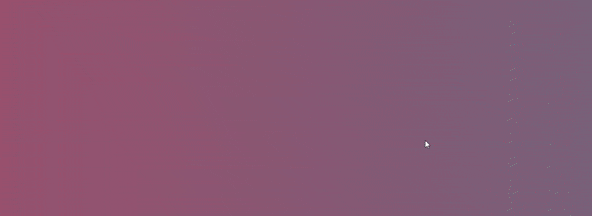
I will give a quick overview on how to create stunning background gradient animations using css in this article. Here is a preview of what we will be creating:
Step 1: The html.
To begin, create a new file named index.html. Copy the code below and paste it into the file.
<html>
  <head>
    <title>Gradient background animation</title>
  <head>
 <body>
   <div class="animated-background">
    </div>
</body>
</html>
In the code snippet above, I have created and defined a div with the class name animated-background.
Let's move on to styling our page now that the HTML file is finished.
Step 2: Styling Our Page.
In this article, we are going to create a new file named styles.css, which we will import into index.html below the title tag using the code below.:
<link href="styles.css" rel="stylesheet"/>
Copy the code below and paste into styles.css:
html, body{
  height: 100%;
}
body{
  display: flex;
  margin: 0;
  padding: 0;
}

.animated-background{
  flex: 1;
}
Notice the following from the code snippet:
There are no default styles on the page because I've given the html body element a margin and padding of zero, and given it a display of flex for a reason, which you'll come to understand as we progress.
The html element has a height of 100%.
In the code snippet, you can see that I've given the
animated-backgroundelement aflex: 1.flex-grow,flex-shrink, andflex-basisare all part of the flex 1 shorthand.Its default value is
0 1 auto, which means:
flex-grow: 0;
flex-shrink: 1;
flex-basis: auto;
It can also be used to fill and expand available space, which is exactly what we have done, using it to fill and expand the width and height of the body element.
- You must have a display of flex in the parent element for
flex: 1to work, this explains precisely why we have a display flex in our body element.
your page is still blank? I know.
Step 3: Write the Gradient Animation.
Copy the code snippet below and paste into your css file:
.animated-background{
  background: linear-gradient(to right, #aa4b6b, #6b6b83, #3b8d99);
  flex: 1;
  background-size: 400% 400%;
  animation: animate-background 10s infinite ease-in-out;
}

@keyframes animate-background {
  0%{
    background-position: 0 50%;
  }
  50%{
    background-position: 100% 50%;
  }
  100%{
    background-position: 0 50%;
  }
}
The background gradient animation should be working perfectly now.
In this article, I won't be discussing how CSS transitions and keyframes function, but here is a great YouTube video that will help you comprehend them and how to utilize them: css animation.
Try experimenting with different % values to see how your background gradient appearance changes using
background-size.The link provides information on how CSS gradients work: css gradient.
Conclusion.
Was this useful?
- Follow me for more post like this so we don't lose track of each other.
- Show your support by leaving lots of reactions.
- Spread the knowledge by sharing it.
Cheers guys.